Invisible Artists · Brand + Design
Brand +
Design
Reports, campaigns, fact sheets, catalogues and films for brands that need complicated things to look simple.
What we do
We design the things people actually read. Clear thinking, strong ideas and craft in every detail, so your brand looks as good as it is.
CompareFX
Brand Identity
Branding suite
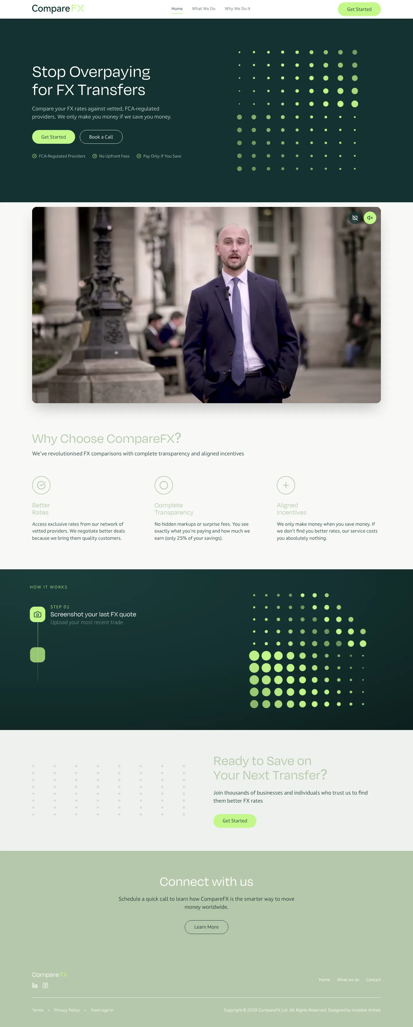
Making foreign exchange feel trustworthy, transparent and firmly in your control.
CompareFX helps businesses stop overpaying on FX transfers by comparing live rates from trusted providers. The brand had to win over decision-makers who are used to banks, so it needed to feel credible and calm, never flashy.
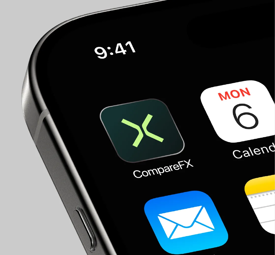
We let the name lead: a clean wordmark with a balanced X brandmark that works from billboards to browser tabs. A palette built on Midnight Navy, Sage Mist and a sharp Lime Frost accent, plus graphic patterns that echo side-by-side comparison, carry the identity across posters, stationery, the app and the website.
Out of home
Stationery
Colour palette
Brandmark
App icon
Live site
The brand, live online.
Anglo American
Infographics
Commodities fact-sheet series
Four raw materials, one visual language, and the everyday reasons they matter.
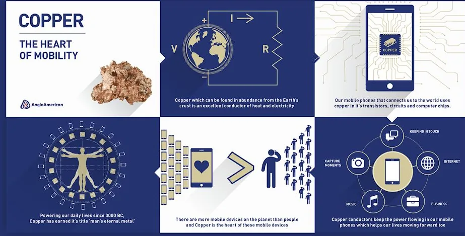
Anglo American wanted to explain why phosphates, iron ore, platinum and copper matter to people who will never visit a mine. The series extended an animated video campaign we were already producing, so it had to sit naturally alongside the films.
Each fact sheet follows the same six-panel grid: the raw material, where it comes from, and four ways it shapes daily life, from fertile farmland to the phone in your pocket. We also rewrote and edited the copy so every panel lands in a sentence.
Diligent
Campaign
The Intelligent Picks Diligent
A fully integrated launch, from the first idea to the last banner.
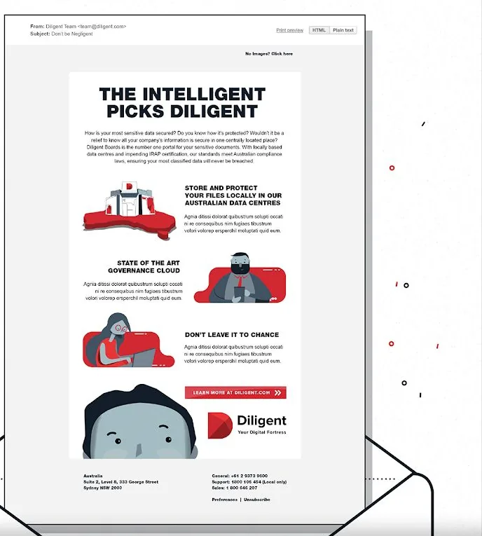
Diligent was bringing its board-governance platform to Australia, with local data centres as the headline. We built the campaign idea, “The Intelligent Picks Diligent”, and carried it across every touchpoint.
That meant a designed and animated video, EDMs, social posts, digital banners and a die-cut direct-mail piece shaped like the Diligent “D”. We wrote all of the copy, so the voice stays the same wherever the audience meets it.
EDM
Social
Direct mail
Digital banners
Online trading platform
Motion Graphics
Binary options explainer series
Making a complicated financial product feel simple in under two minutes.
Trading is full of jargon and quick decisions. This explainer series walks new traders through the platform step by step: do your research, pick an asset, call high or low, and watch the clock.
We wrote the scripts with the client, then applied their brand look across every frame: bold yellow typography, gritty textures and on-screen UI, so the films feel like the product they’re selling.
High.
Low.
Go.
DV8 Works
Retail
Ford Ranger customs collection
A catalogue that sells attitude as hard as it sells accessories.
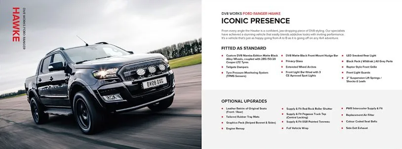
DV8 Works builds custom Ford Rangers and the parts that go with them. Their catalogue needed to work as a product reference for dealers and as a lifestyle piece for buyers.
We art-directed the photography, wrote the copy and laid out every spread, from the Hawke and Truck Top hero pages to the wheel and lighting ranges. Black, steel and a hard DV8 red keep it unmistakably theirs.
Birmingham residential
Print Collaterals
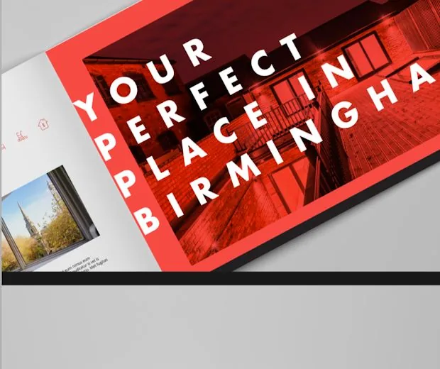
This is Living
Selling a postcode, not just a property.
For a new residential development in Birmingham, the brochure had to sell the city as much as the apartments. “This is Living” and “Your perfect place in Birmingham” became the lines that hold the whole suite together.
Bold red blocks, full-bleed lifestyle photography and generous white space give the brochure a confident, editorial feel, carried through to the sales-suite collateral and digital assets.
Capabilities
Strategy, design and copy, under one roof.
Brand identity
Logos, systems and guidelines that hold up everywhere.
Corporate literature
Annual and sustainability reports, brochures, decks.
Infographics
Complex data and ideas made obvious at a glance.
Integrated campaigns
One idea carried across every channel and format.
Motion graphics
Explainers, social cut-downs and animated brand assets.
Retail & catalogue
Product storytelling that works on shelf and on screen.
Print collateral
Brochures, direct mail and point-of-sale.
Copywriting
Words written with the design, not poured in afterwards.